National Car Rental App
Timeline
2022 - 2023
My Role
Product Designer
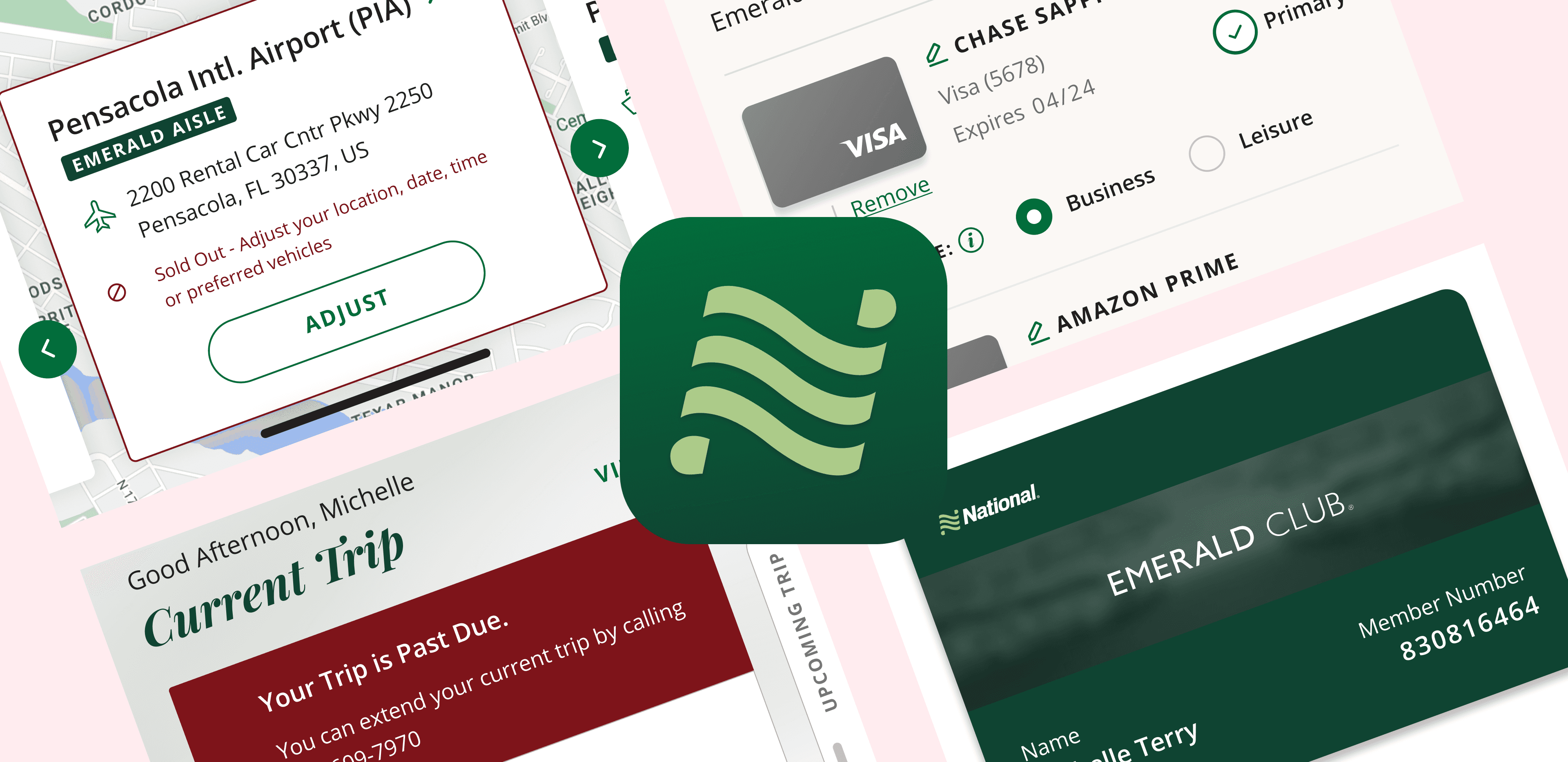
National Mobile App
National Car Rental came to us with a request to improve their outdated National Mobile App (NMA) experience.
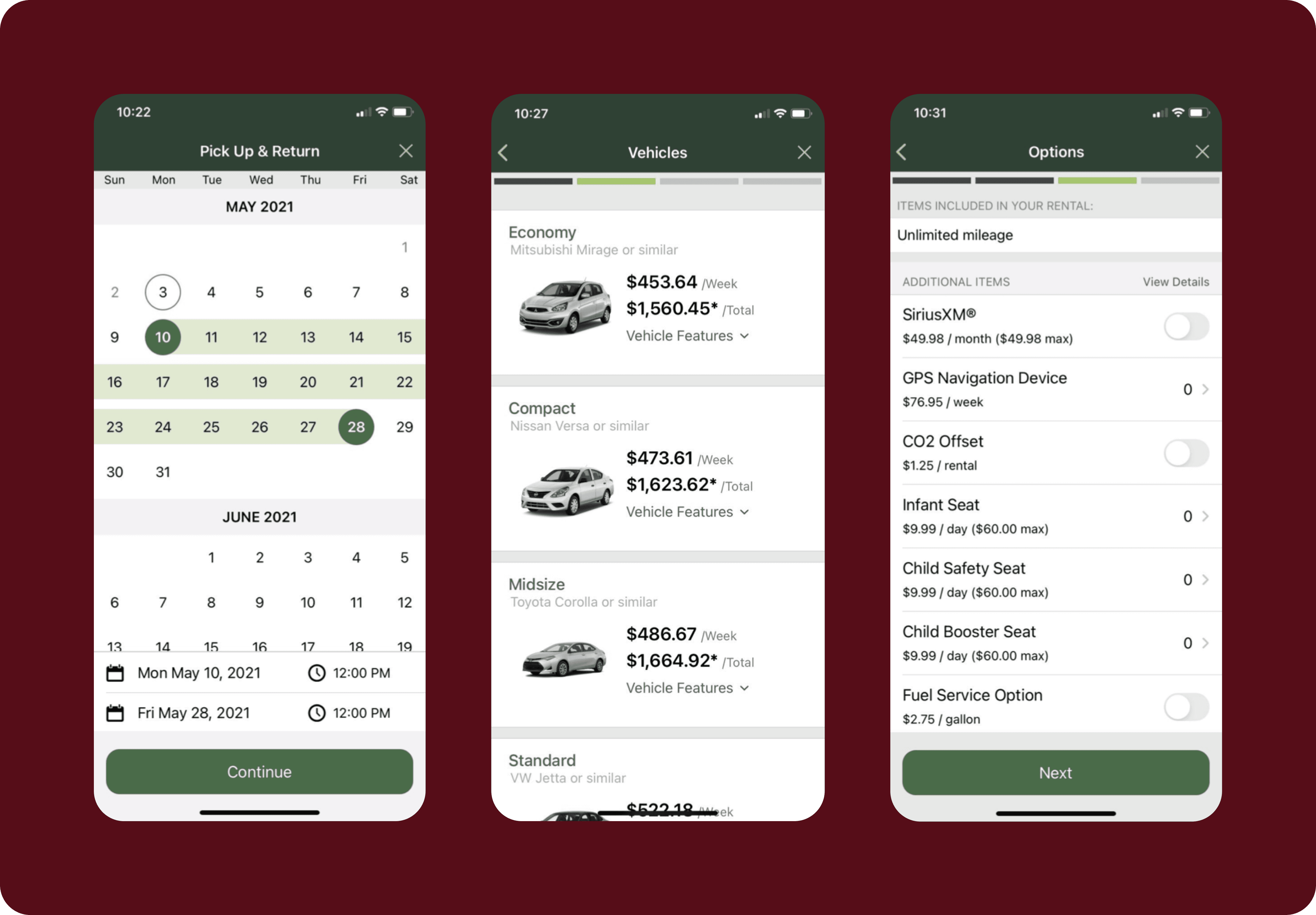
Previous outdated National Car Rental screens.
To go beyond a visual UI update, I participated in exploratory work to discover pain points and new opportunities.

Zoomed out view of a User Experience Research Canvas with several sticky notes.
Once we got to designing we kept these learnings in mind. We user tested along the way, and created a collaborative working environment so that the client could stay involved throughout our design process.
NMA Exploration
As part of the exploration process, My team completed more than 40 stakeholder interviews and I prepared and ran a dozen of them. We successfully synthesized various opportunities and pain points.
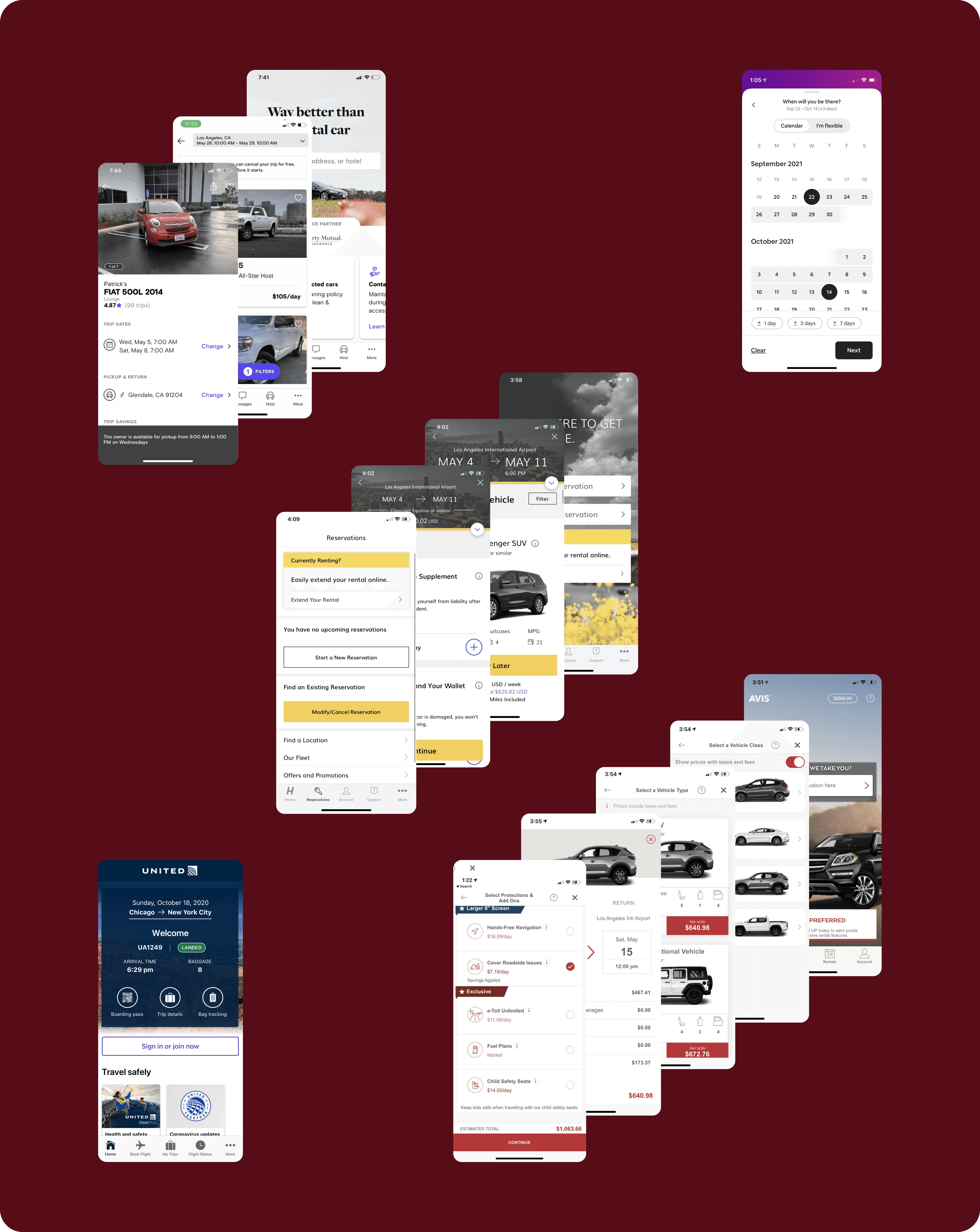
Competitor Analysis & Indirect Feature Hunting Screens showing Hertz, Turo, Avis, Airbnb, & United Airlines.
I participating in analyzing more than 10 different competitor experiences to identify gaps and areas in which NMA can excel.
Conducted online user research with 39 past customers of National and competitors to understand their business travel needs.
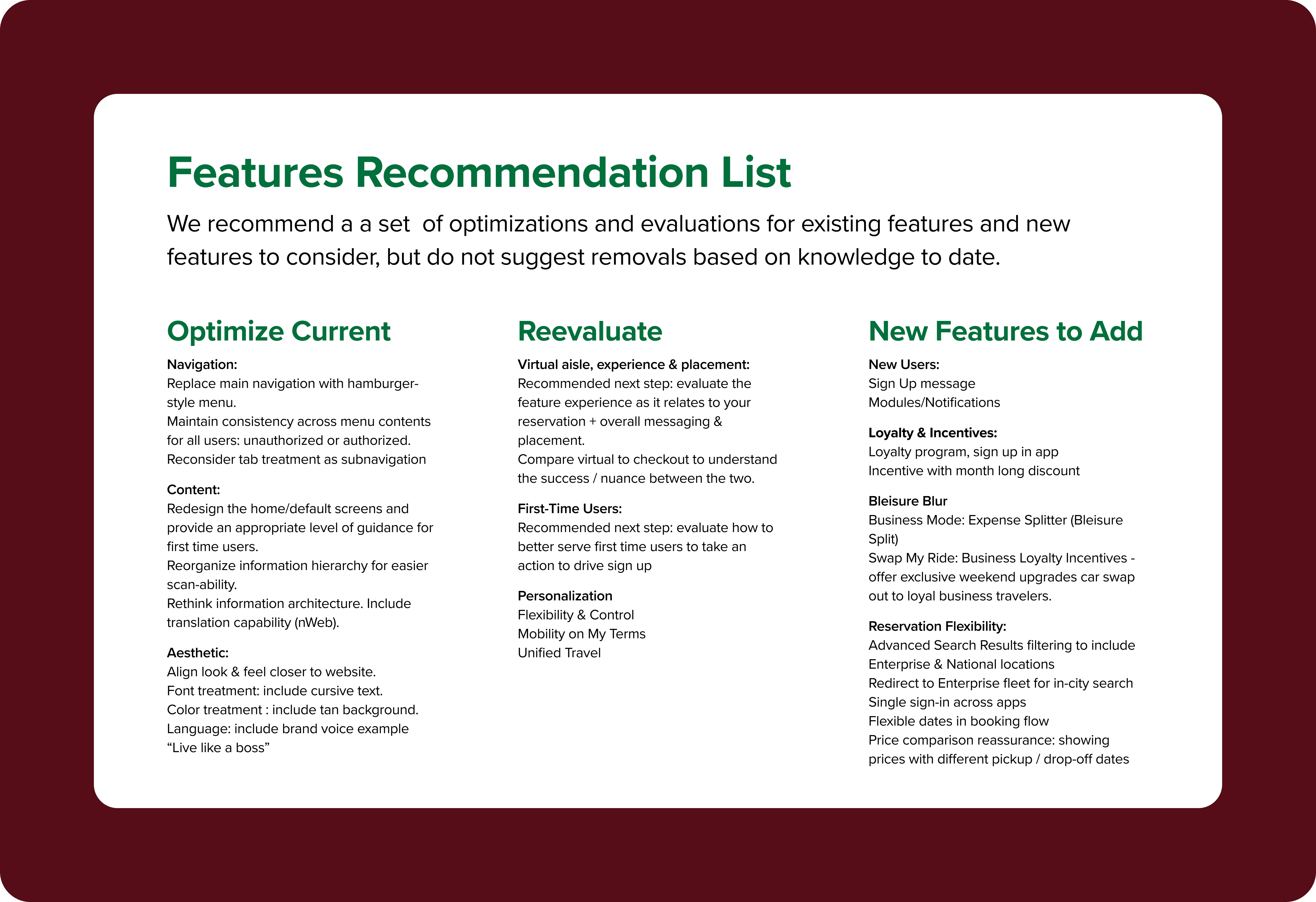
Early features recommendation list for National Car Rental
We synthesized the results and came up with several feature recommendations, many of which we were able to implement with cooperation from the client.
Some key takeaways and their resulting features included:
64% of users wanted to be able to split their trip purpose between work and play; or the ability to edit payment use for business or leisure.
77% of users that we interviewed mentioned that they would prefer to use a visual map view vs the existing list view.
Another area that we found which needed improvement is accessibility. I conducted an accessibility audit and applied best practices in our design process to ensure that we delivered an app that met WCAG 2.1 AA compliance.
Bleisure
National Car Rental was aware of the customers' desire to split their trip's purpose between Business and Leisure which we confirmed after speaking with 39 previous users. They had coined this combination of Business and Leisure, "Bleisure", however, they needed our help in figuring out the best way to implement this new functionality into their app.
We began with a real-time collaboration sessions between the client, a business analyst, a UI designer & me, as the UX designer. We built out requirements and flows to best integrate Bleisure, or the capability for user's to designate payment methods for either business or leisure usage and then plan trips accordingly.
Designating Usage
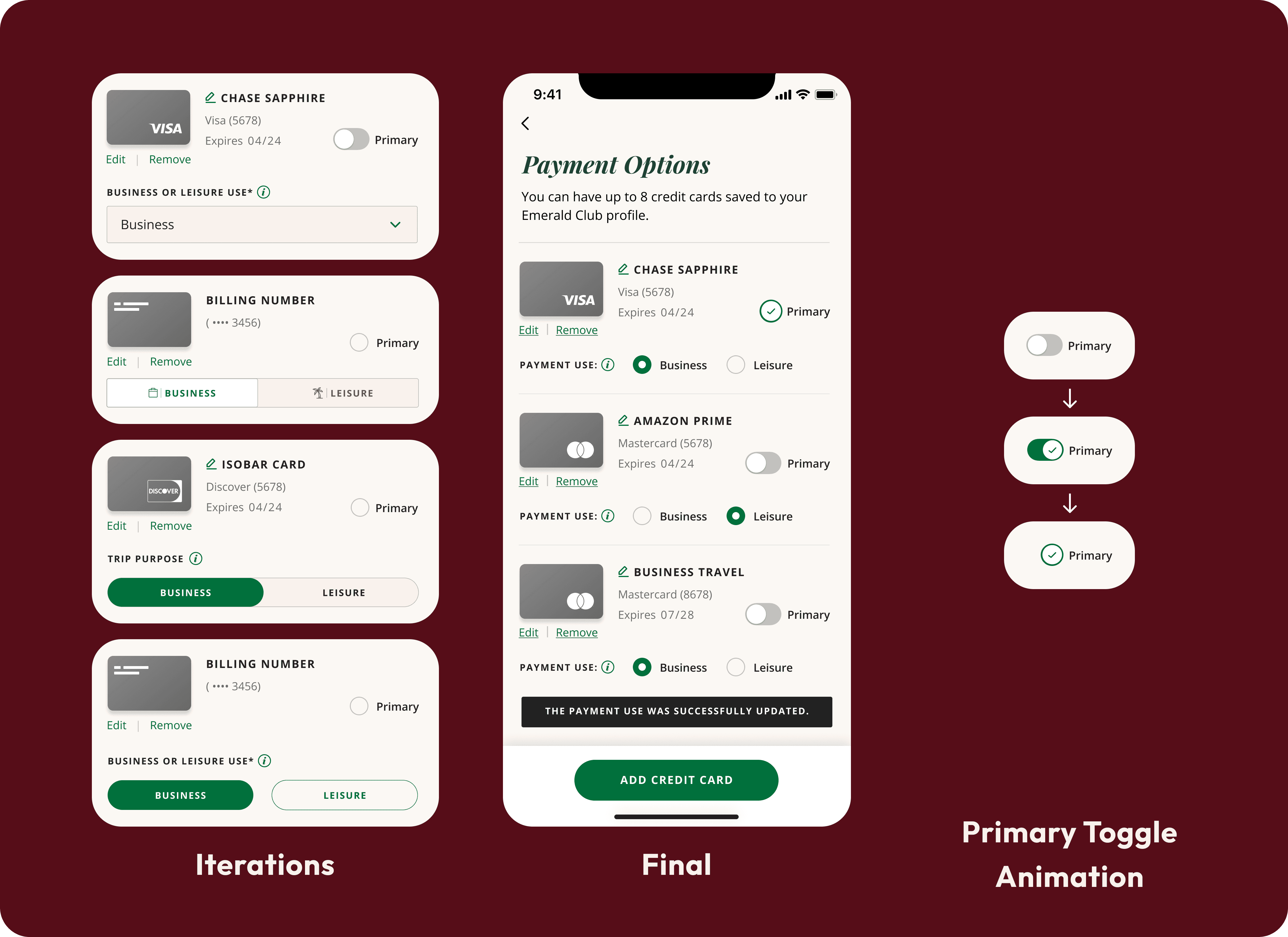
Iterations for setting card use as business or leisure and the final outcome.
While iterating we faced many blockers in development funding that did not allow for the creating of new components such as the two middle iterations on the left, a switch and a toggle. Due to this it was necessary that we designate the Business or Leisure selection method as two radio buttons.
We also needed to communicate to the user that they could only have one primary card. To not have a confusing array of radio buttons, I designed the primary card selector as a toggle which acts as a radio button and upon being selected cannot be unselected, tapping another card's toggle remove's the current primary card's status as such.
Bleisure Restrictions
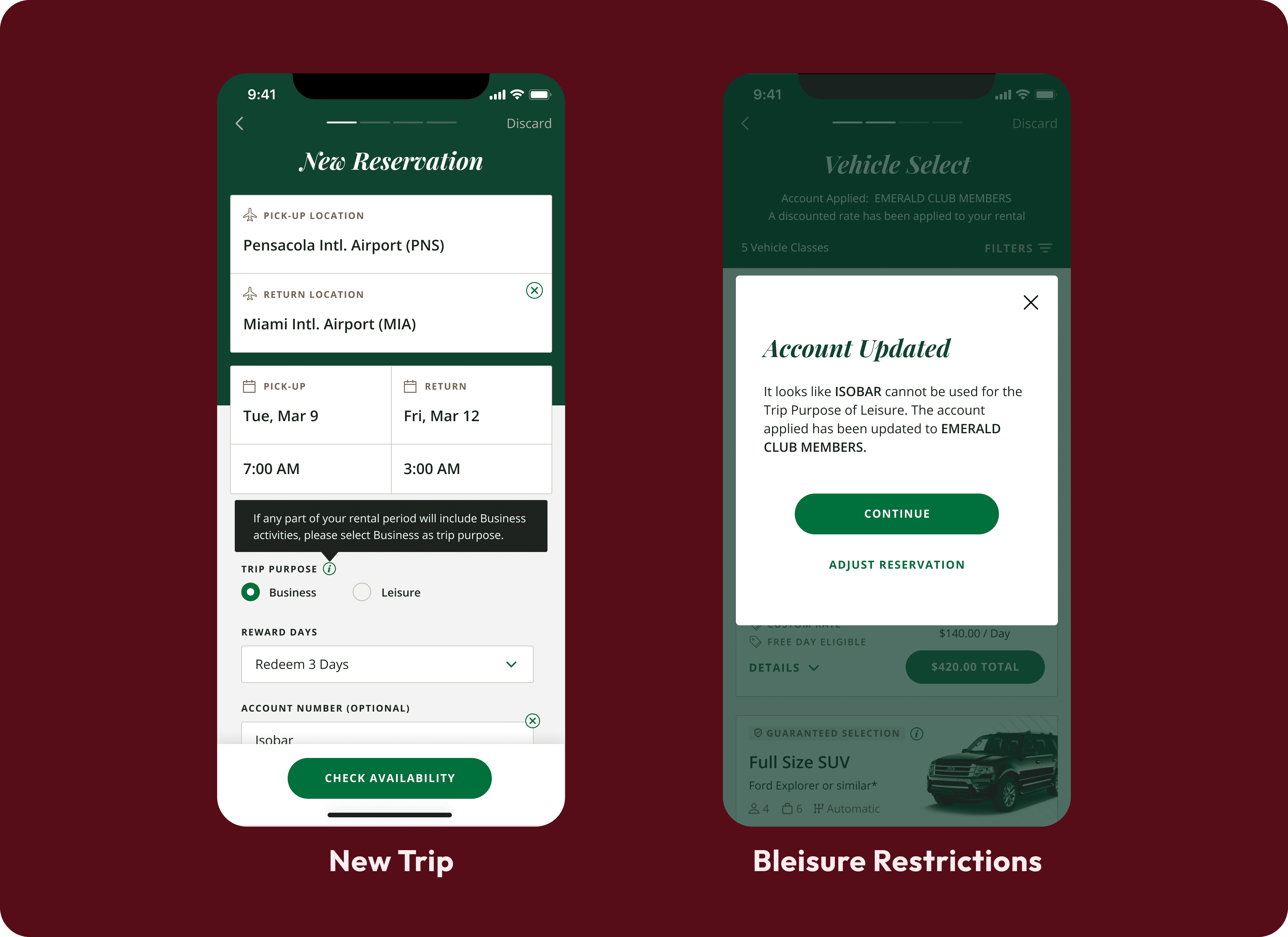
Bleisure's impact on the new reservation screen and a restriction that appears from selecting incompatible billing accounts and trip purposes. Information conveyed via tooltip & modal.
The Bleisure radio selection pattern must then be repeated on the new reservation screen to maintain consistency across the app.
Since it is a new feature we needed to explain to the users certain limitations surrounding Bleisure's usage without needing to create unnecessary friction. Some information was disclosed in the form of a tooltip and other information arose only when the user attempted an incompatible combination of billing account and trip purpose.
Review Business or Leisure Use
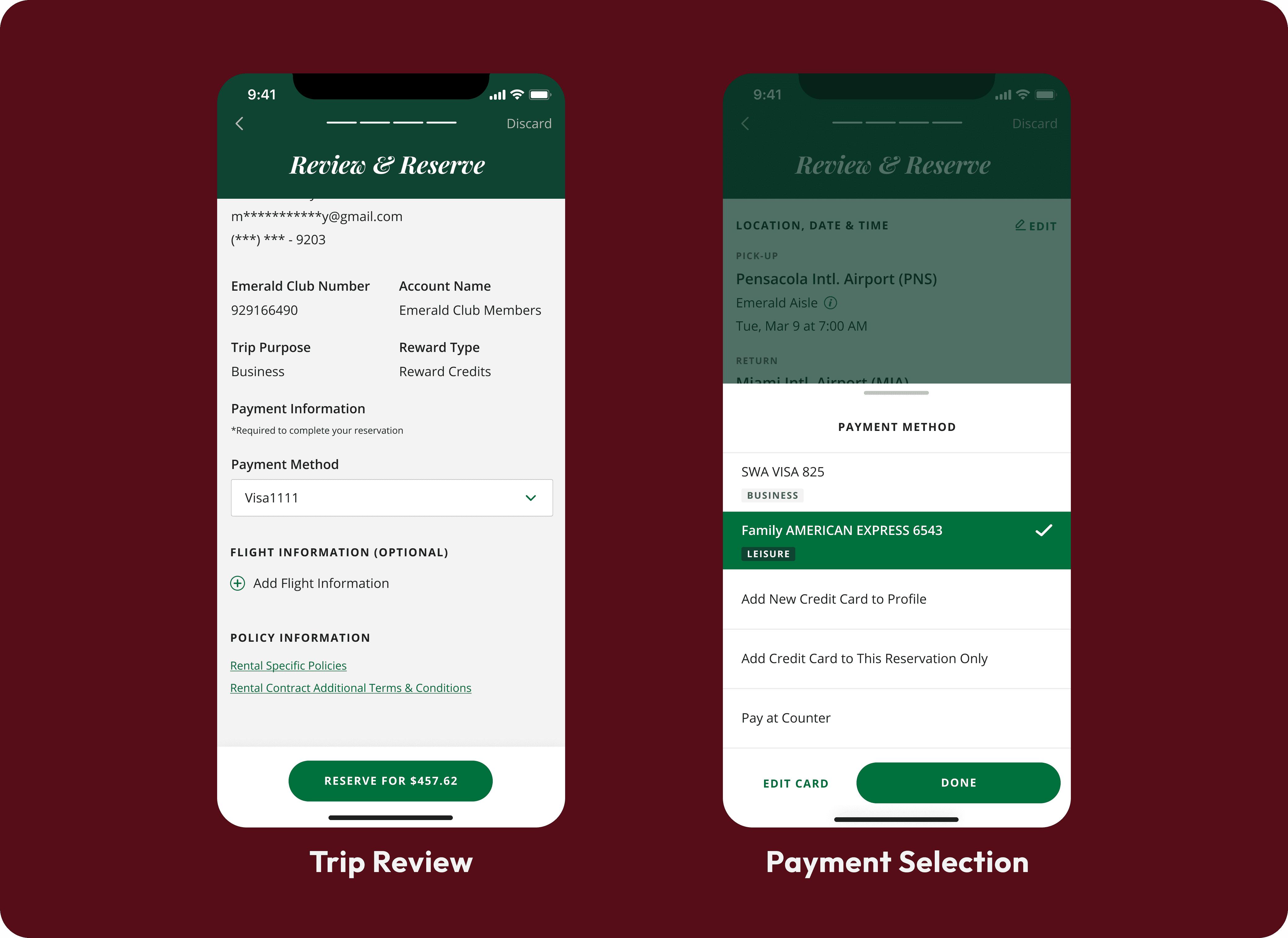
Bleisure information available for review at checkout, trip purpose & the payment method's business or leisure allocation
At the final review screen before confirming a reservation, the user is able to once again see their trip purpose and if they wish they are able to make edits to their payment method. If the user wishes to edit their payment method a drawer pops up for which we designed new tags to clearly indicate a card's Business or Leisure designation. Any new cards added to their profile at this stage are automatically designated accordingly as Business or Leisure depending on the trip purpose that has already been selected by the user.
Map View
Near the end of the project, one of the last flows my team handled for the client, besides QA, was Map View. My team dwindled down to a business analyst for strategy support, a couple of developers and me as the sole designer doing UX & UI design.
List View Before Map View
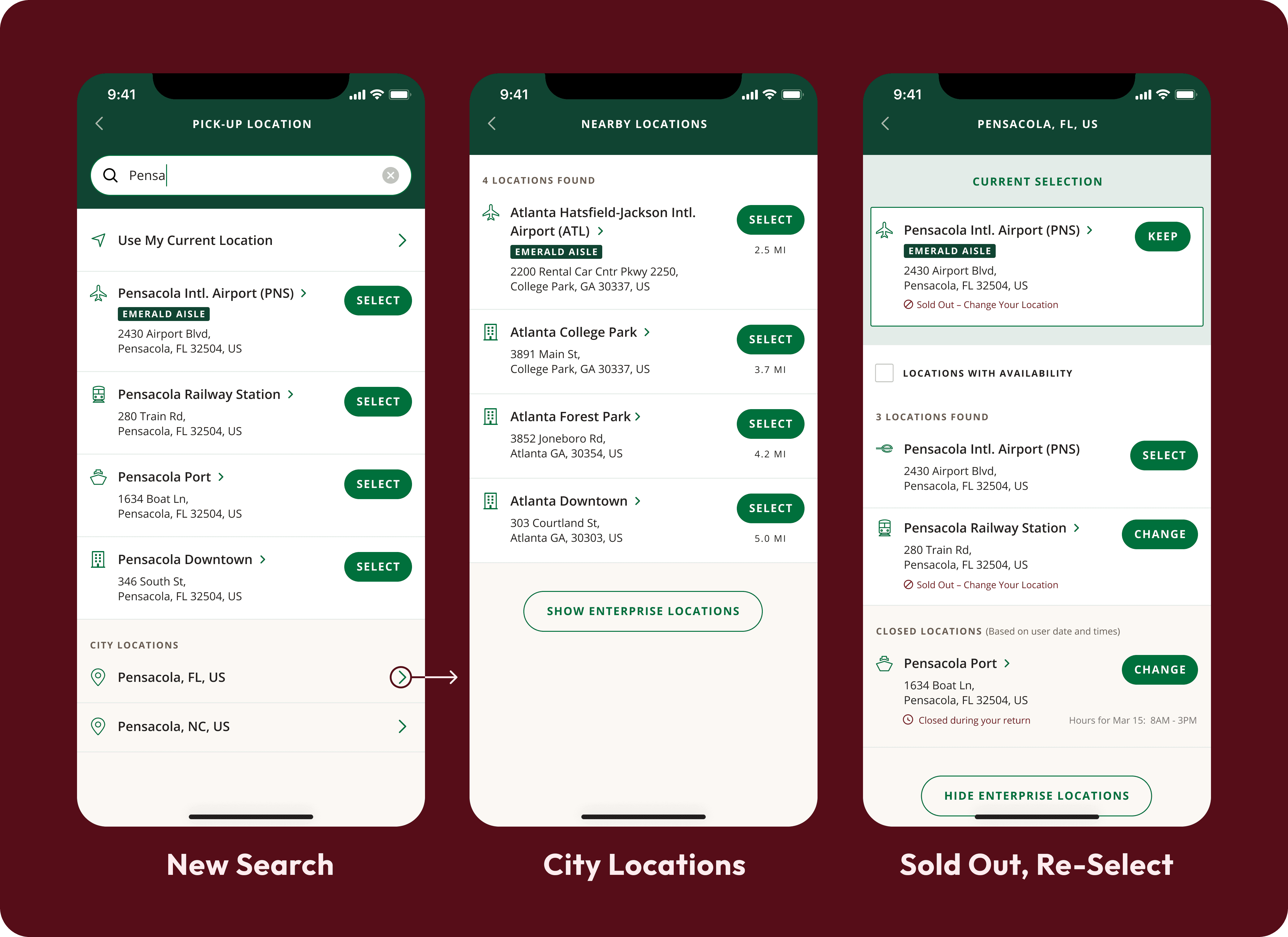
Pre-Map-View location selection list view screens. First a new search screen with search field at the top populating results, then locations in a city, and finally a sold out screen prompting another selection.
National Mobile App design was split into two phases. Phase one was more of a visual lift and included all the flows that were necessary for launch. We designed the above list view screens during phase one. However, Map View was not considered crucial so we needed to iterate on this flow in phase two.
Location Card Iterations
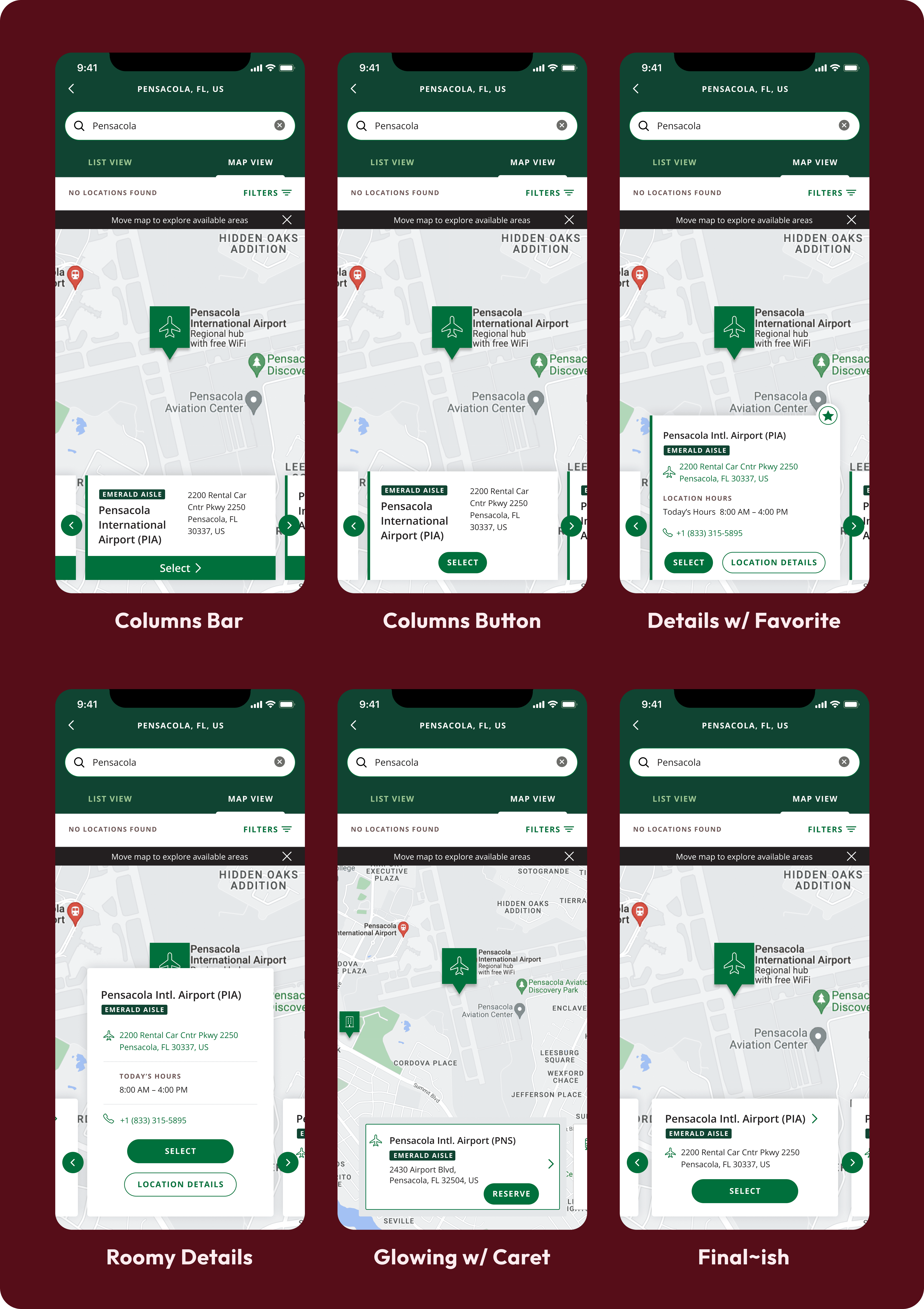
Six Map View location detail card iterations, some with columns, some with rows, a varying amount of information & other differences.
I began iterating on Map View by designing different approaches to the location detail card. I knew that I wanted to have "previous" and "next" action buttons due to accessibility concerns since some users struggle with dragging motions. I also experimented making the card itself tapable leading to more location information or having a dedicated CTA for more information. I needed the primary CTA to confirm the location and move the user to the next step.
I ended up with a simple card that conveys the card's tapability with a caret by the location title and it includes an icon to convey the location type such as an airport.
Tab-less Drawer Iteration
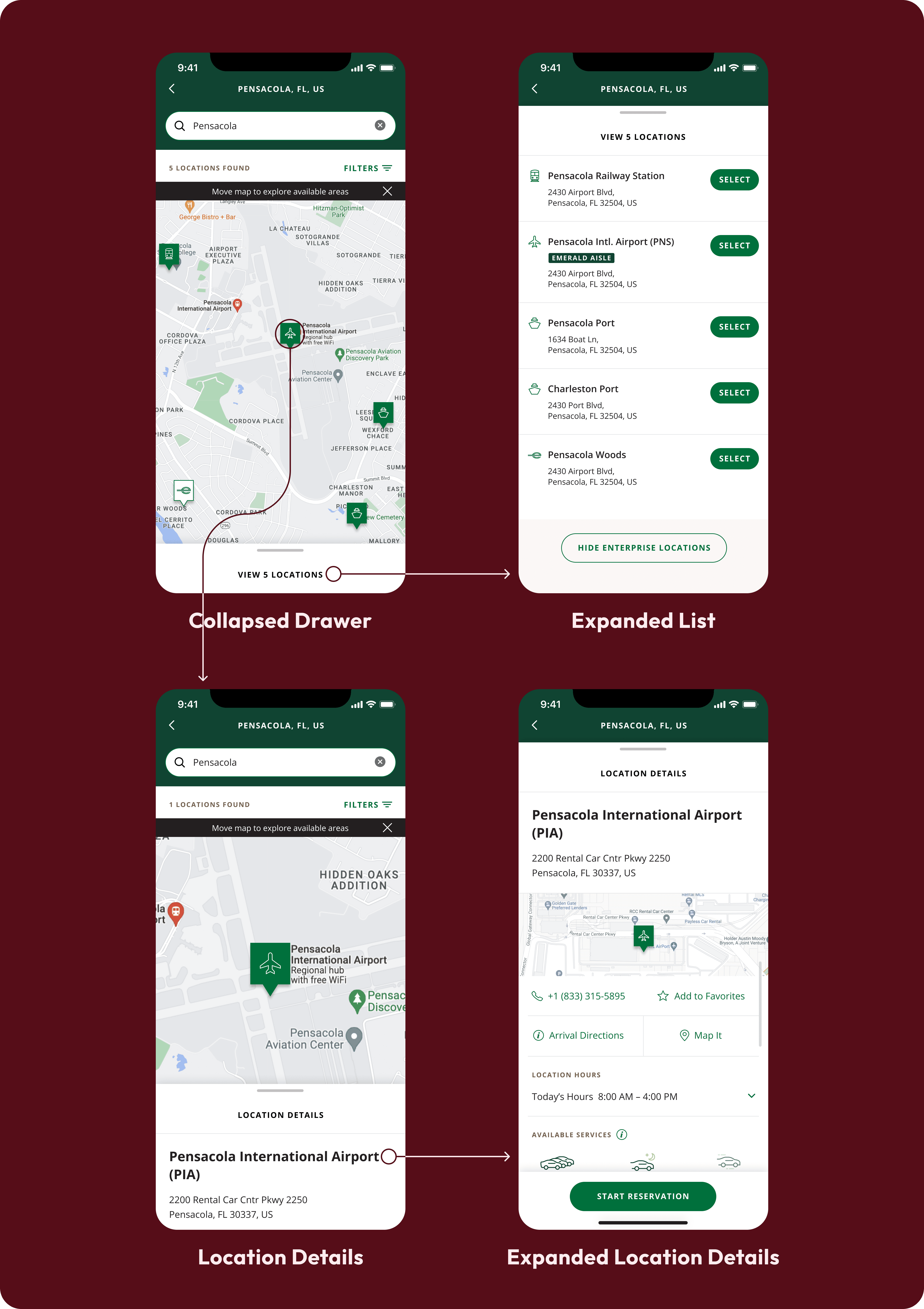
Drawer iterations which allow for a tab-less experience. Users arrive to map view after searching for a city and the drawer show’s a list view. Selecting a specific location reveals location details.
My tab-less drawer iteration was an attempt to find a solution that would be conservative with the screen space not available for the map itself. When the drawer is collapsed in these iterations, the map takes up 67% of the screen compared to 46% with the Map and List Tabs that I originally envisioned.
This iteration was declined by the client due to it requiring more development time with the List View rebuild which they were reluctant to buy into.
Header Iterations
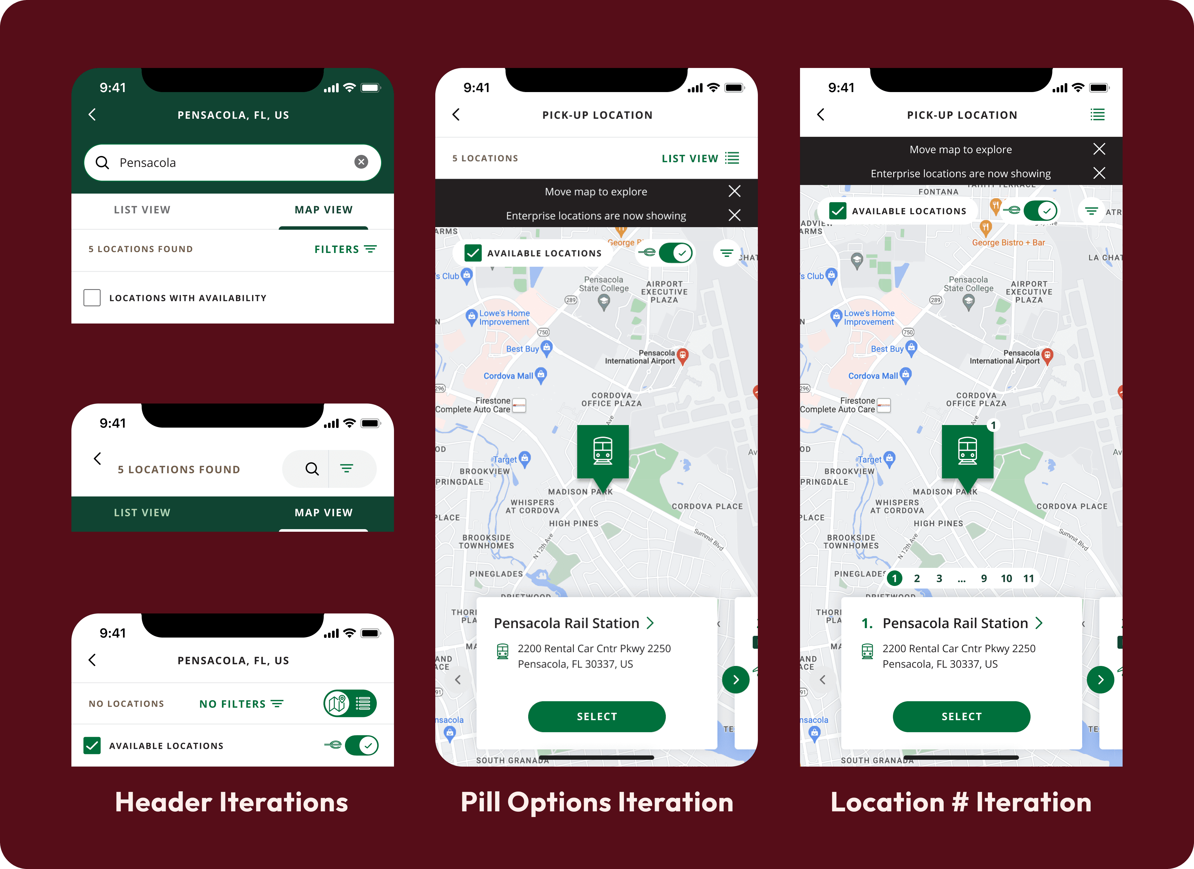
Map View header iterations. There are iterations showing alternatives to the list / map tab and other available options such as showing available locations. Iterations include toggles, pills, buttons and checkmarks.
I wanted to continue exploring ways to decrease header space. This involved alternatives to the map / list tab, ways to minimize the location search when not in use, placing filters in "pills" that overlayed on the map, and experimented with removing the number of locations from the header and placing the information with the location cards below.
In the end we decided to keep the list and view tabs since tabs are an existing pattern on the app and would have been a lower ticket development lift. We also decided to keep the number of location results in the header to align with the pre-existing list view.
Final Map View
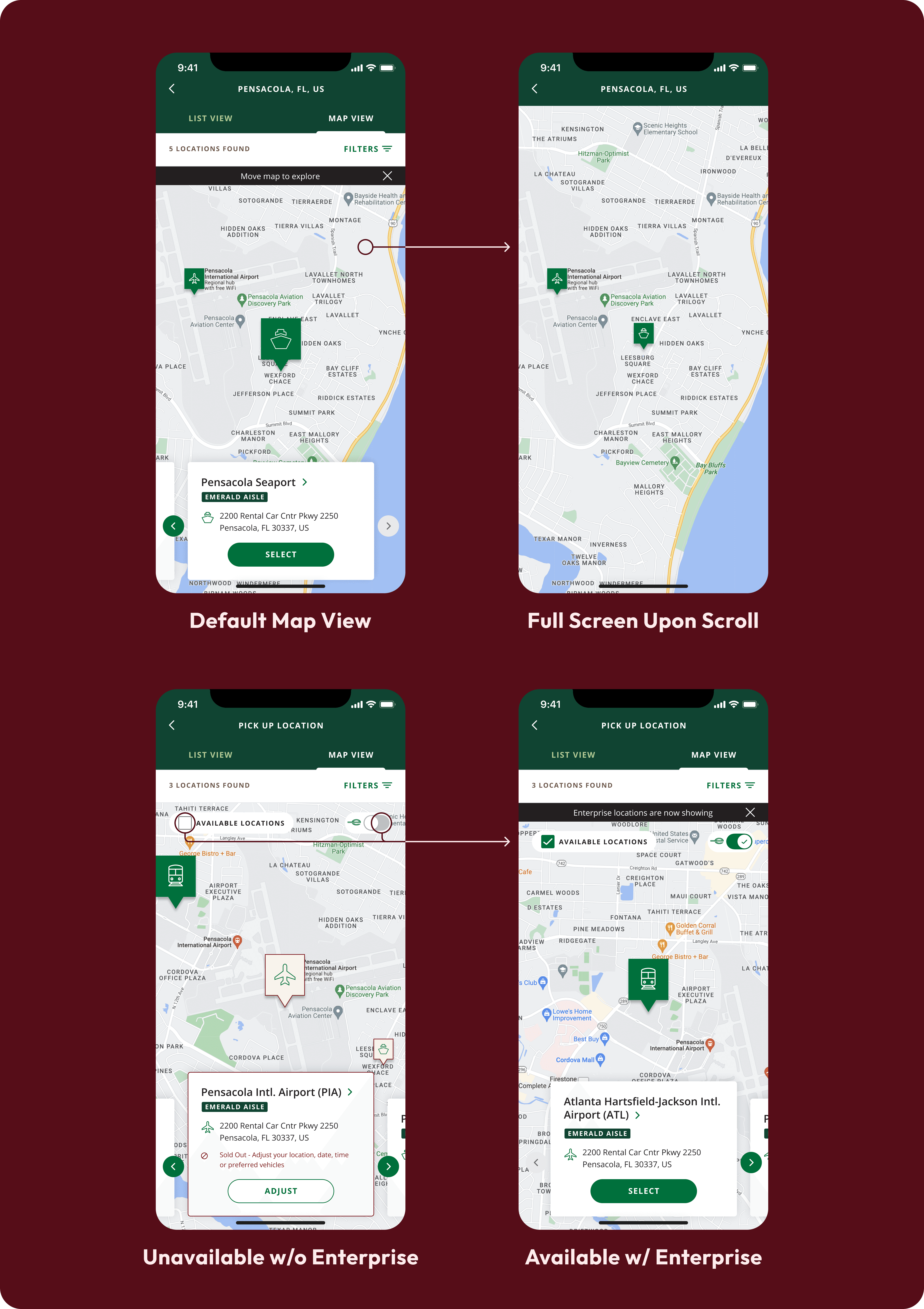
Final Approved Map View that I designed. Showing default Map View, full screen upon scroll, unavailable without Enterprise, & available with Enterprise.
I designed the version of Map View that we ended up with to reveal plenty of map scrolling space when the user dragged around the map. The previous iterations all tried to conserve header and card space in one way or another and I believe that has plenty of benefits but I'm glad that having to scrap those ideas did not end up meaning that we sacrifice map area, at least while scrolling.
For uncommon scenarios, we were able to implement the filter pills to quickly toggle the appearance of available locations and locations belonging to National's parent car rental company, Enterprise, without blocking much of the map.
Given that the Enterprise Location viewing toggle (the pill with the green Enterprise logo, an "e") is not very clear in terms its function, let me explain. I designed it to only appear once the user scrolled to a part of the map without National locations, at that point a modal would pop up asking the user if they would like to view Enterprise locations. If the user accepts then the Enterprise toggle will appear overlayed on the map to give users the ability to stop viewing Enterprise locations. When the user toggles Enterprise locations they also receive a banner explaining that the Enterprise locations appear or disappear.
I designed the sold out locations to have a sharp visual contrast with available locations, and to not rely on color alone to convey the unavailability, I also made the "Sold Out" information available within the location card.
This final version of Map View aligned with the business needs at a time when we were wrapping up designs for hand-off to the client. There were many restrictions that I was happy to creatively work around and I'm proud of the result.
Conclusion
In conclusion, the transformation journey of the National Mobile App (NMA) has been a testament to the power of user-centric design and collaborative problem-solving. What began as a request to update an outdated interface evolved into a comprehensive exploration of user needs, competitor analysis, and the implementation of innovative features.
Through extensive stakeholder interviews, user testing, and competitor analysis, we identified key pain points and opportunities for improvement. One of the significant findings was the demand for a seamless integration of business and leisure travel, known as "Bleisure." Working closely with the client, we devised strategies to integrate Bleisure functionality effectively, ensuring a smooth user experience while navigating trip purposes and payment methods.
Accessibility was another crucial aspect that received meticulous attention, with the implementation of best practices in pursuit of WCAG 2.1 AA compliance, guaranteeing inclusivity for all users.
The journey to redesign the National Mobile App also involved overcoming challenges, such as limitations in development funding and the need to iterate on features like Map View within phased approaches. Despite these hurdles, our team persevered, leveraging creativity and collaboration to deliver solutions that met both user needs and business objectives.
The final iteration of Map View stands as a testament to our dedication to user experience and interface excellence, offering intuitive navigation, clear visual cues, and seamless integration with Enterprise locations.
Overall, the redesigned National Mobile App represents a significant step forward in enhancing the user experience, catering to the evolving needs of travelers while maintaining alignment with National Car Rental's business goals. As we conclude this phase of the project, we look forward to seeing the positive impact our efforts will have on user satisfaction and business success.