Design Annotations + Accessibility
Timeline
2024 - 2025
My Role
Lead Designer and Change-Agent
The Annotation System
This work was based off of annotations originally designed by another designer which I redesigned and expanded upon, including adding completely new annotations for accessibility.
Originally another designer created a general annotation component system to document copy, changelog, differing states and variants, and other miscellaneous context such as display rules and interactions. I conducted internal testing and interviewing to find ways to interweave this better into our process and improve the annotation system. Also having an interest in accessibility I completely revamped and redesigned the annotations to not just educate and promote accessibility but also be more accessible.
Design annotations are useful as a reference during the design process.
Annotations help designers keep track of changes via notes providing context regarding design choices; variants, interactions, constraints, motion, etc. Annotations are incredibly useful during handoff from the design team to the development team or the client.
Accessibility annotations help ensure that accessibility is thought through and integrated from the very beginning which is more time effective than having to work backwards later on in the process.
Find the Figma Community file here.
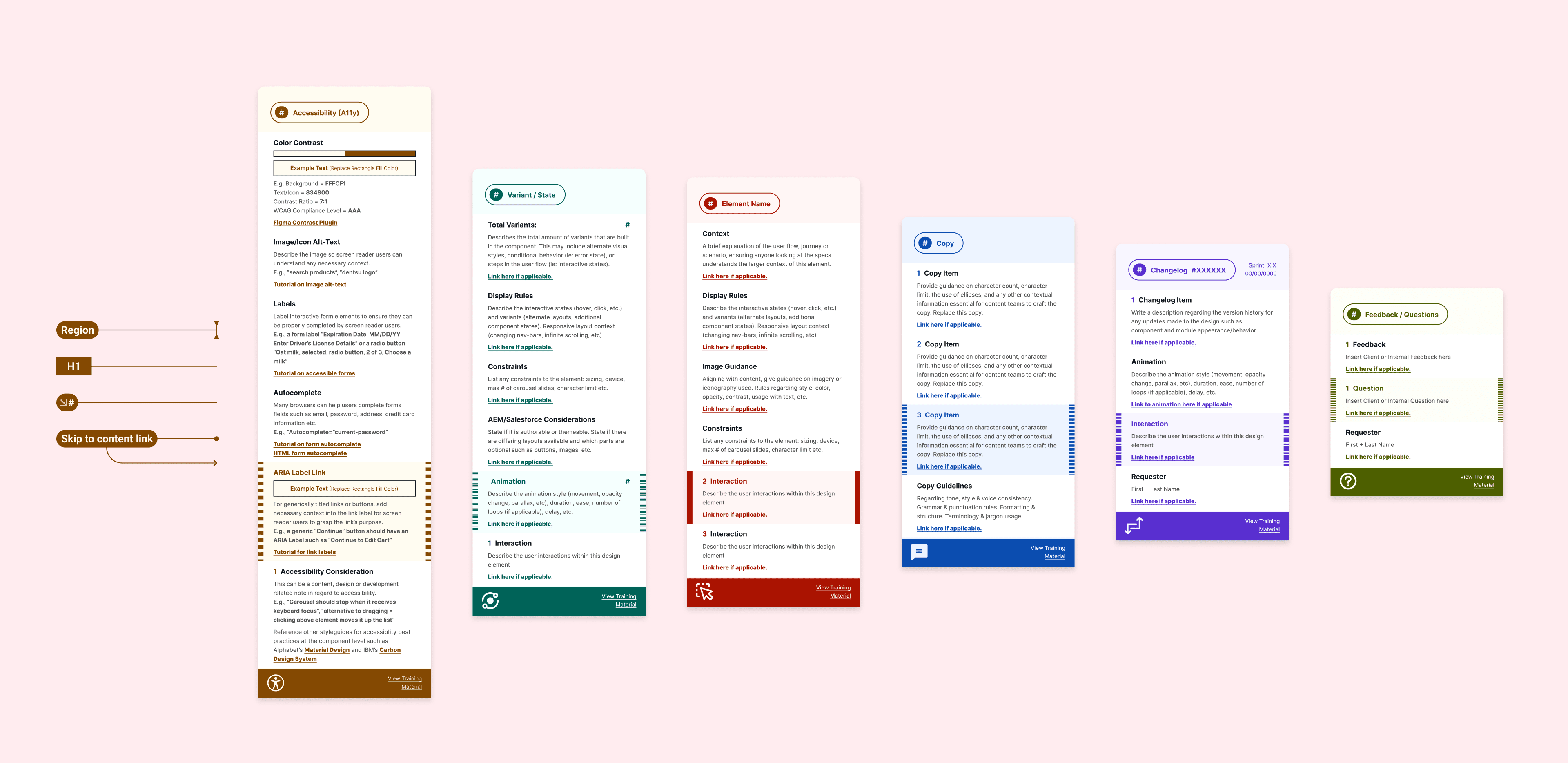
How we set up General Annotations
Annotation system in-situ examples with relevant copy, and arrows pointing where applicable
We created an annotation system to capture necessary interactions, image guidelines, constraints, etc. It is also flexible enough to capture miscellaneous context and considerations.
We broke it down to 6 different types of annotations that a designer makes throughout the design process including:
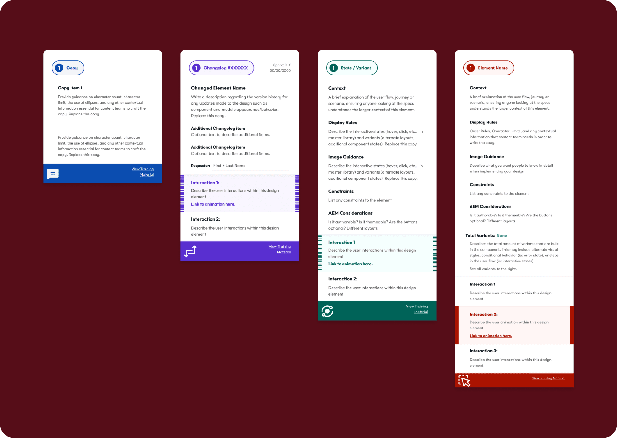
Default: Covers basic annotation needs for most designs.
Copy: UX copywriting and notes on it.
State / Variant: Ensures visibility of alternative components.
Changelog: Track changes after initial design has gone through first approval.
Accessibility: Improves WCAG Compliance.
Feedback: For use during meetings with stakeholders.
Accessibility Annotations
Accessibility Annotations overview with each category having a title, description , an example, and a tutorial link.
I expanded on the general annotations by creating accessibility specific annotations which are necessary during the design process to design with accessibility best practices in mind and to ensure that developers will implement code specific design details. Placeholder description text also doubles as brief guidance to educate annotators on accessibility.
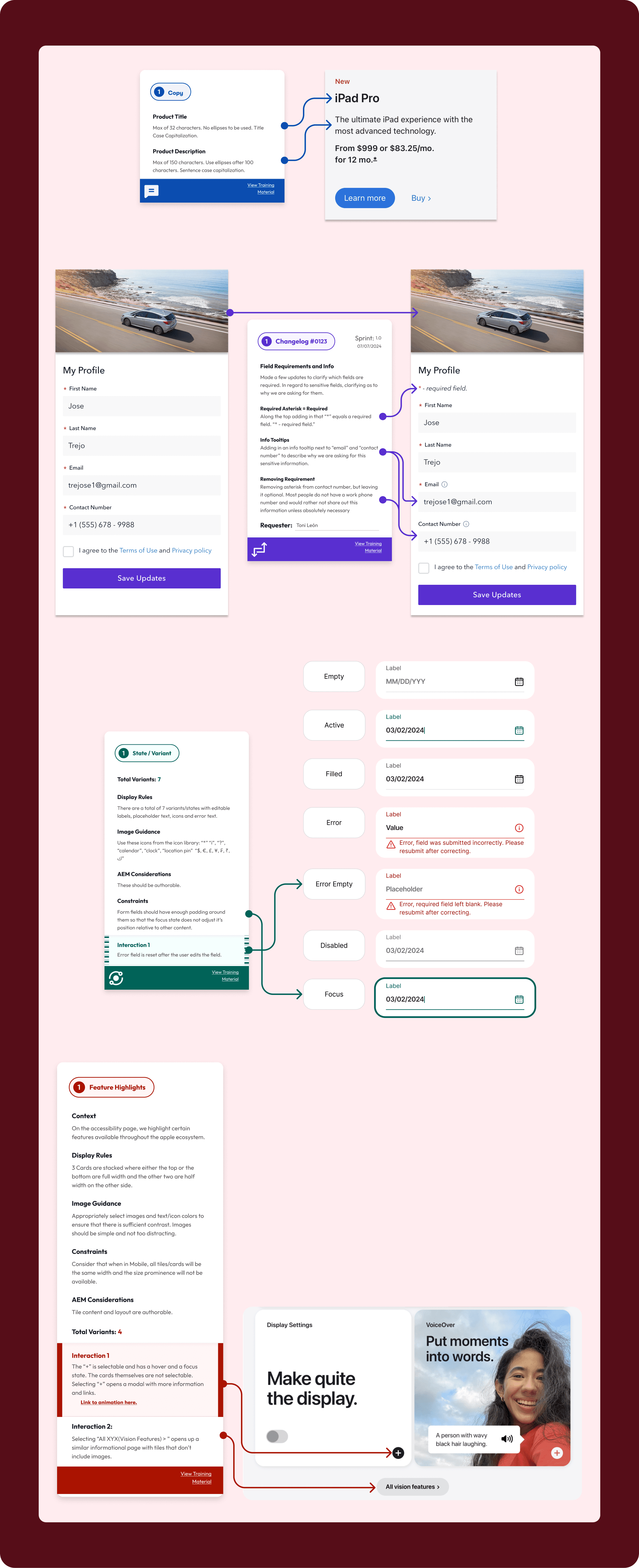
Examples of the Accessibility Annotations
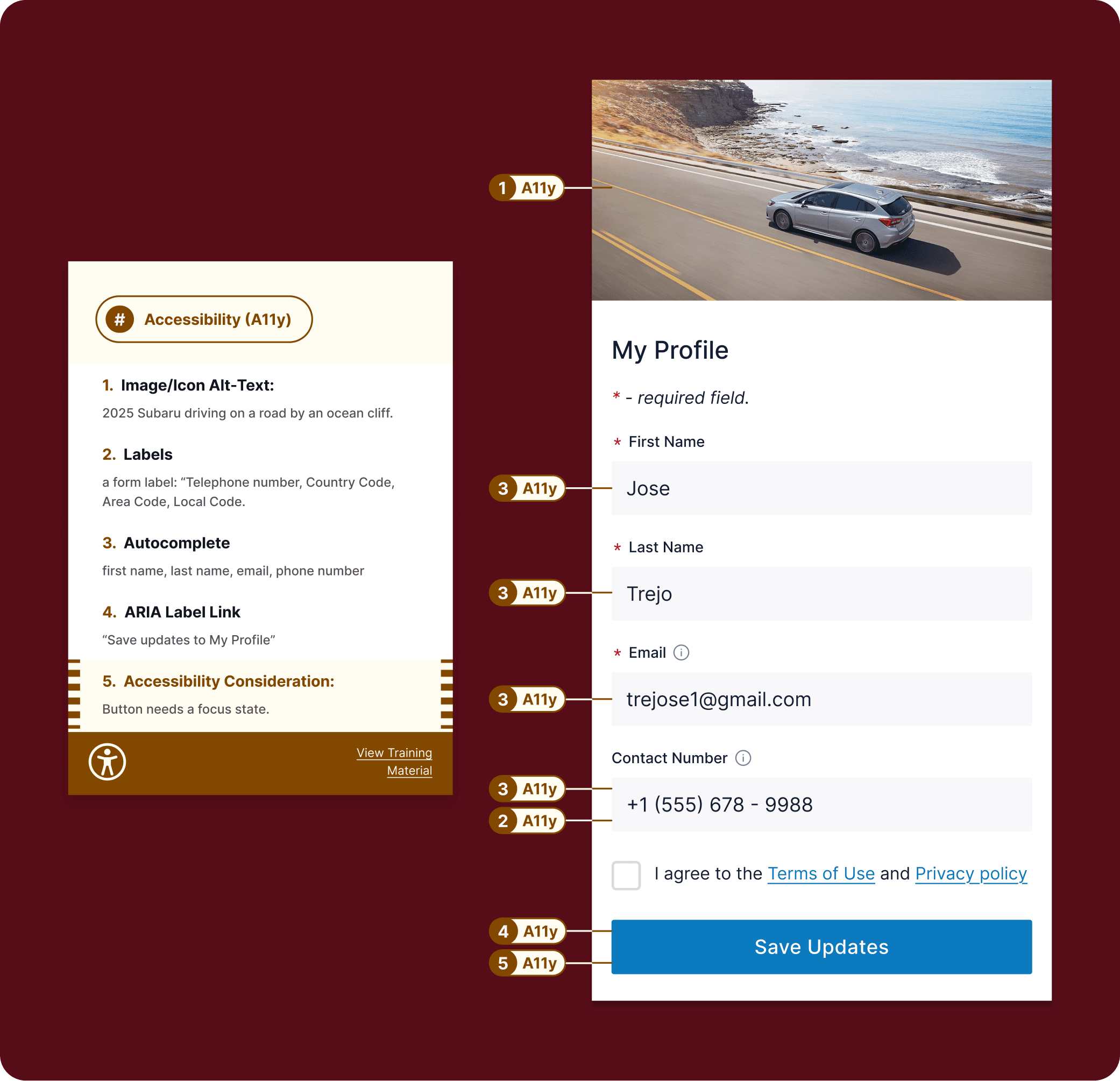
Accessibility annotation example of a profile form and annotations applicable to the form fields and the submission button.
Accurate and equal image alternative text.
Proper form labels with necessary instructions.
Enabling form autocomplete on capable devices.
Adding context to generic links and buttons using ARIA.
Misc. accessibility considerations. such as focus states
This example annotation is highlighted to express urgency to the design team.
Color Contrast Annotation
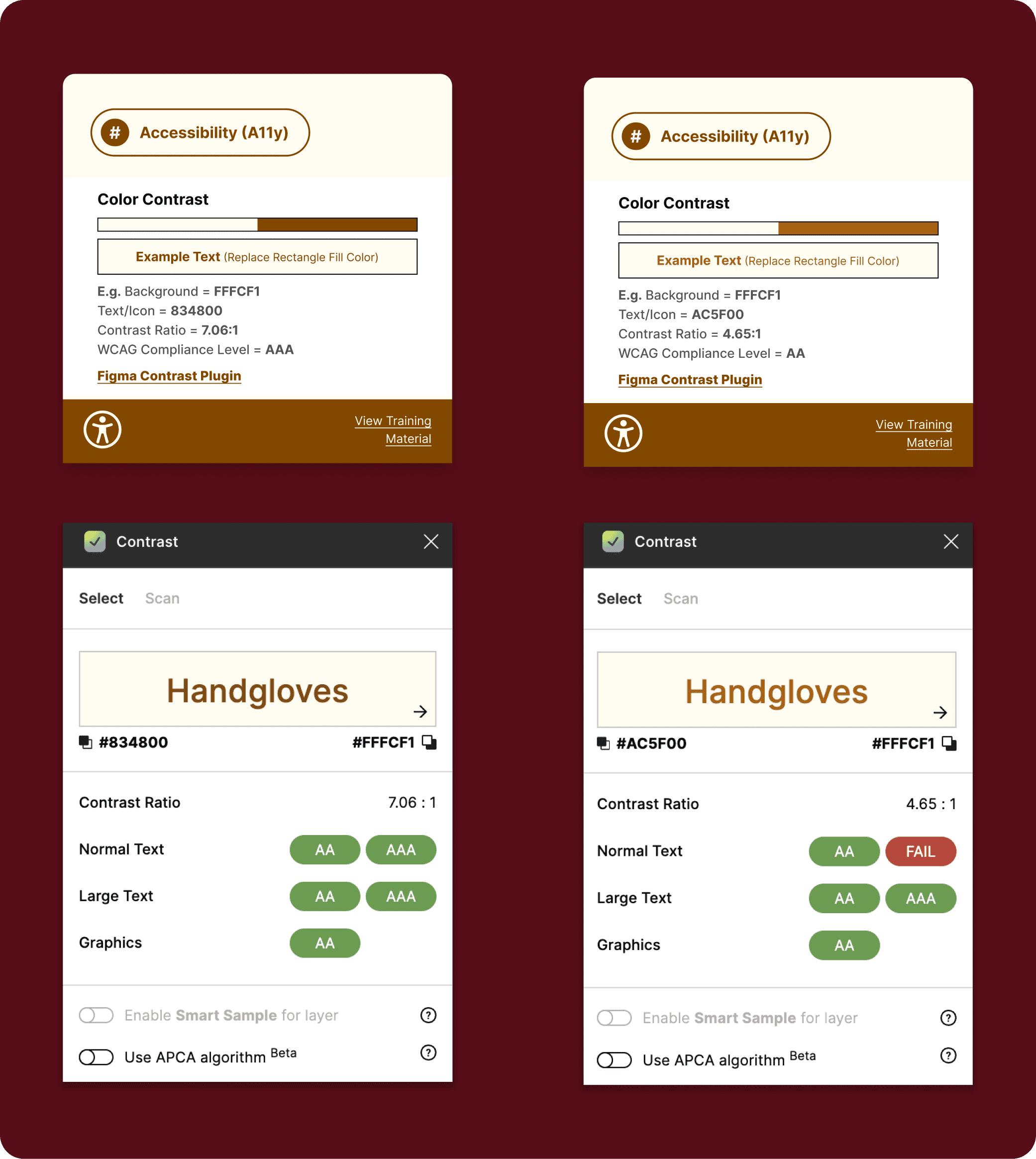
A color contrast annotation which compares two colors against each other and can at a glance show which WCAG level is met. This is a above a screenshot from the "Contrast" Figma plugin.
This color contrast annotation is helpful while creating design systems or anytime a new color combination or component is created. This allows teammates to capture color contrast compliance with WCAG 2.2 at either level AA or AAA as necessary and have it displayed.
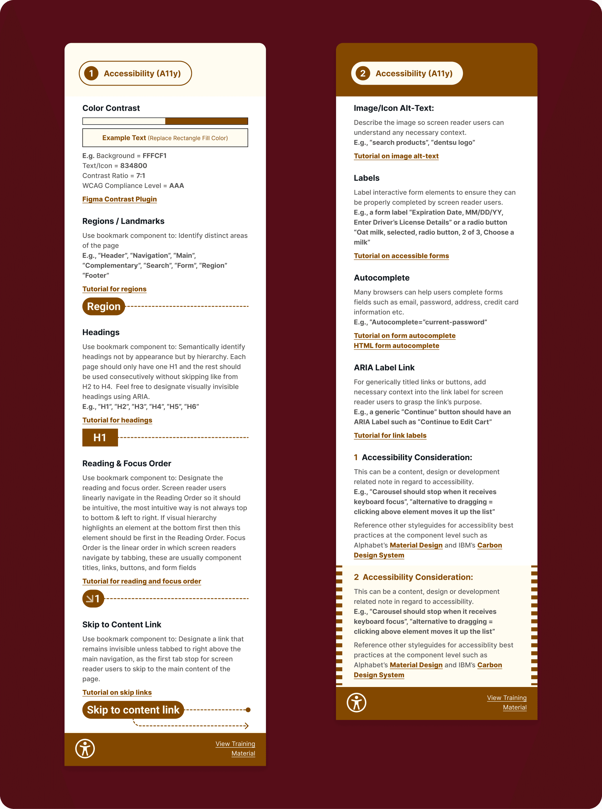
Regions or Landmarks Annotation
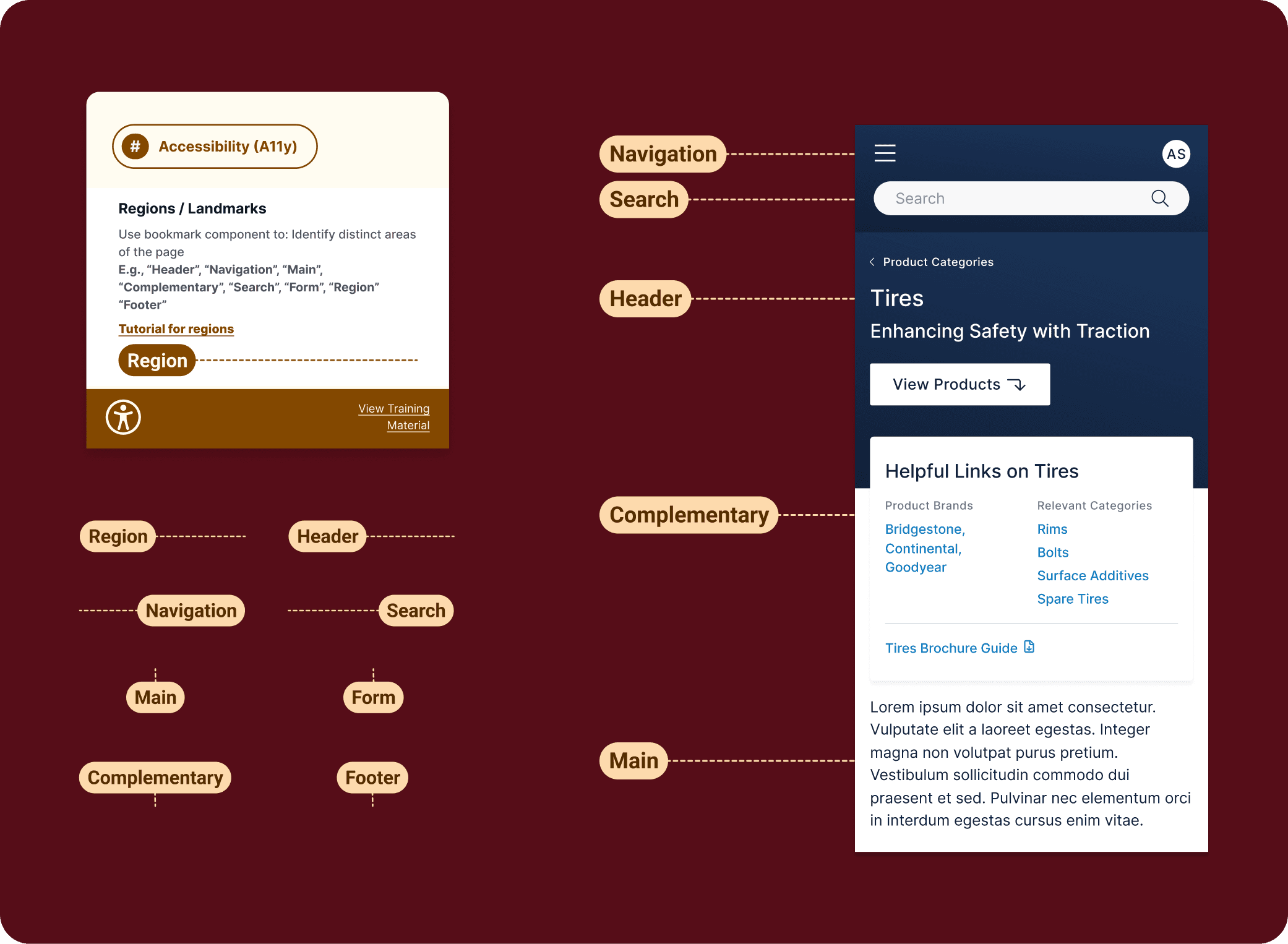
Overview of regions or landmarks annotations with bookmark style pointing tags in different directions and an example to showcase how they would be used next to a design.
Semantically identifying regions or landmarks allows screen reader users to more easily skim screens for sections that they may be searching for. Shifting accessibility left includes educating designers on properly identifying these areas of designs for developers.
Reading & Focus Order Annotation
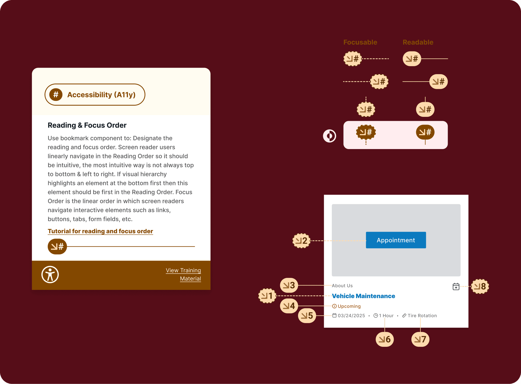
Overview of reading and focus order annotations with a brief guide and example as well as different variations of the component, including a dark mode.
Designing the order in which we would like someone’s visual focus to go into has 2 dimensions X & Y and is done with hierarchy, text weight, color, size, etc. This information is lost to screen reader users which navigate linearly in one dimension.
This highlights the importance of semantically identifying reading and focus orders so their device doesn’t default to reading content from left to right which may not always be the intended or most intuitive way to process information.
Where is it now?
As previously stated the annotation kit has since been shared on the Figma Community where it is constantly evolving to feedback, check it out there to view the latest iteration. It has been used by various teams across dentsu to great success. My colleagues geek out about it more-so for the general design annotations which I lured them in with and slowly they've learned a bit more about accessibility just by using the component within their work. I'm greatly appreciative of having had this positive reception from my peers!